Beautyocracy: Social Commerce for Beauty

Designing a community-driven beauty discovery platform for women of color, from early research to beta launch.

Timeline

Sep 2021 to May 2022 (12 weeks active design)

4 Weeks, Fall 2025

Team

Senior Designer, Engineer, Founder

My role

UX/UI Design Intern

Tools

Figma, Framer, Miro, Adobe Illustrator

The Challenge

Women of color face a unique problem in beauty: the industry isn't built for them. Products are marketed broadly, reviews come from people who don't share their skin type or concerns, and the process of finding something that actually works is exhausting.

Beautyocracy's mission was to change that by building a platform where women of color discover and shop beauty together. My job was to help take the platform from early concepts to a working beta.

What Research Told Us

The team had already conducted interviews with over 100 women of color before I joined. I synthesized this existing research to ground our design decisions. Five patterns stood out:

Too many options. Users felt overwhelmed by choices and distrustful of marketing claims.

Tedious discovery. Finding a product that actually works takes too much time and energy. Users wanted a shorter path to the right answer.

Social proof drives decisions. Users rely on reviews, but they don't trust most of them. They want honest opinions from real people.

Identity matters. Users specifically seek recommendations from people who look like them and share similar skin attributes. Friends and family are the most trusted source.

Shared experience builds trust. Users want to find others with the same skin type, skin conditions, and age range. Similarity is the foundation of trust.

From Insights to Product Concepts

These research patterns pointed to three core design principles that guided every feature decision:

Curation over catalog. Instead of showing everything, personalize recommendations based on identity, skin type, and concerns. Reduce the overwhelming options problem.

Social proof over marketing. Surface honest reviews from real users who share similar attributes. Replace brand-driven content with community-driven content.

Community over isolation. Connect users with people like them. Make beauty discovery a shared experience, not a solo research project.

Designing the Core Flows

Onboarding

We designed a question-based onboarding flow asking about identity, age, skin type, skin concerns, and goals. These weren't arbitrary. Research showed these are the exact factors that drive product purchase decisions for our users. The answers would power personalized user and product match recommendations throughout the platform.


Dashboard

The dashboard facilitates user and product discovery through match cards. Each user card shows a percentage match based on shared profile attributes, narrowing results to only relevant people. Products are categorized into groups for comprehensibility, and expanded product cards include reviews from other users on the platform.

The key design decision: match percentage is front and center. Research told us that similarity drives trust, so we made similarity the first thing users see.


Shelf

Users build a digital beauty "shelf" that other users can browse. This turns individual routines into community resources. If someone with your exact skin type and concerns has tried a product, you can see their honest take and add it to your own routine.


Beta Launch and Testing

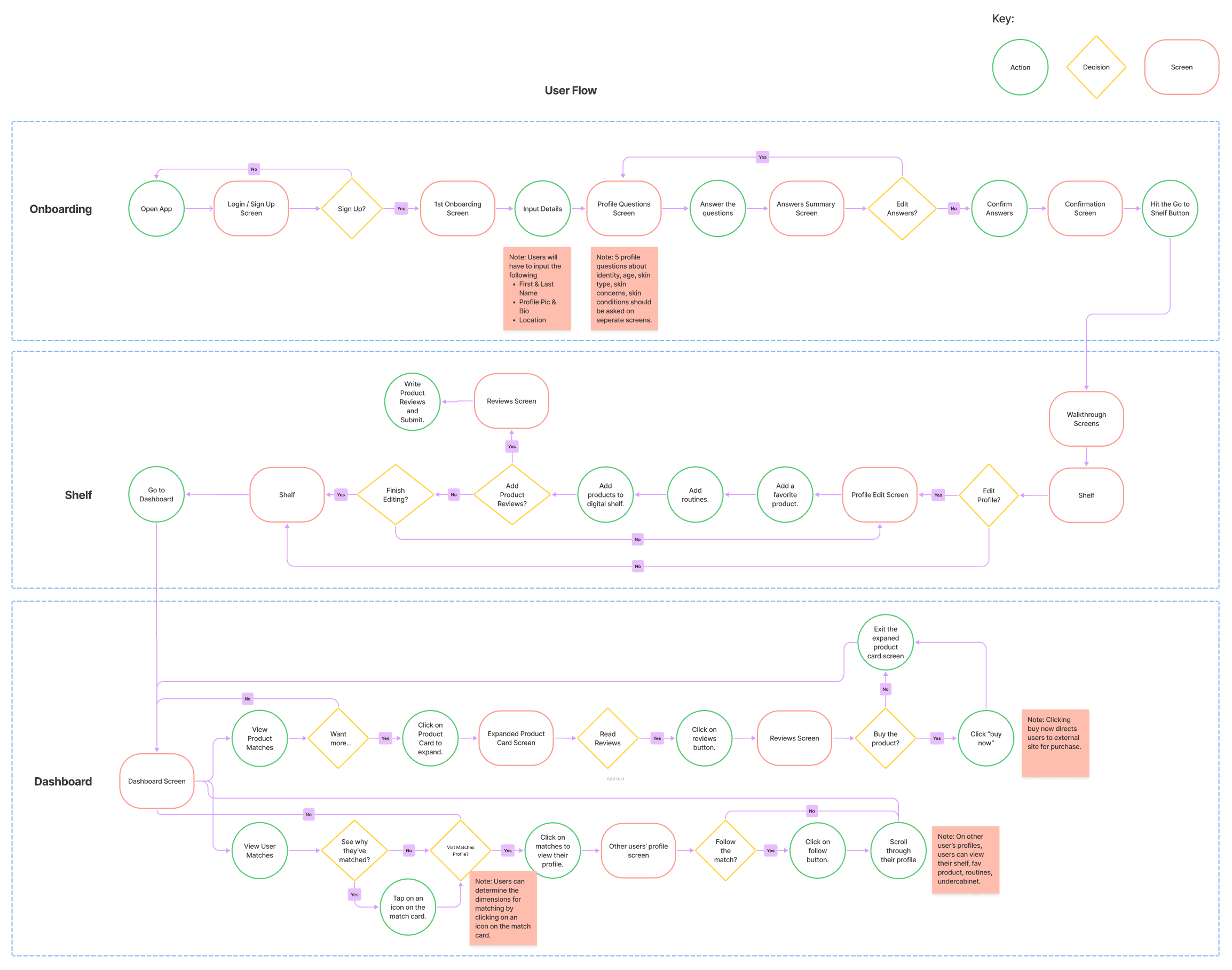
We launched the beta to a select group of users from the waitlist. The launch grew the customer base by 50%.

I then led usability testing with 10 beta users and conducted observational studies to evaluate the live product. Five key issues surfaced:

Users didn't know what to do with matches. The match cards were shown but the next action wasn't clear. Users needed more guidance on how to engage.

Filtering was missing. Users wanted to narrow matches further beyond what the algorithm provided. They wanted control alongside personalization.

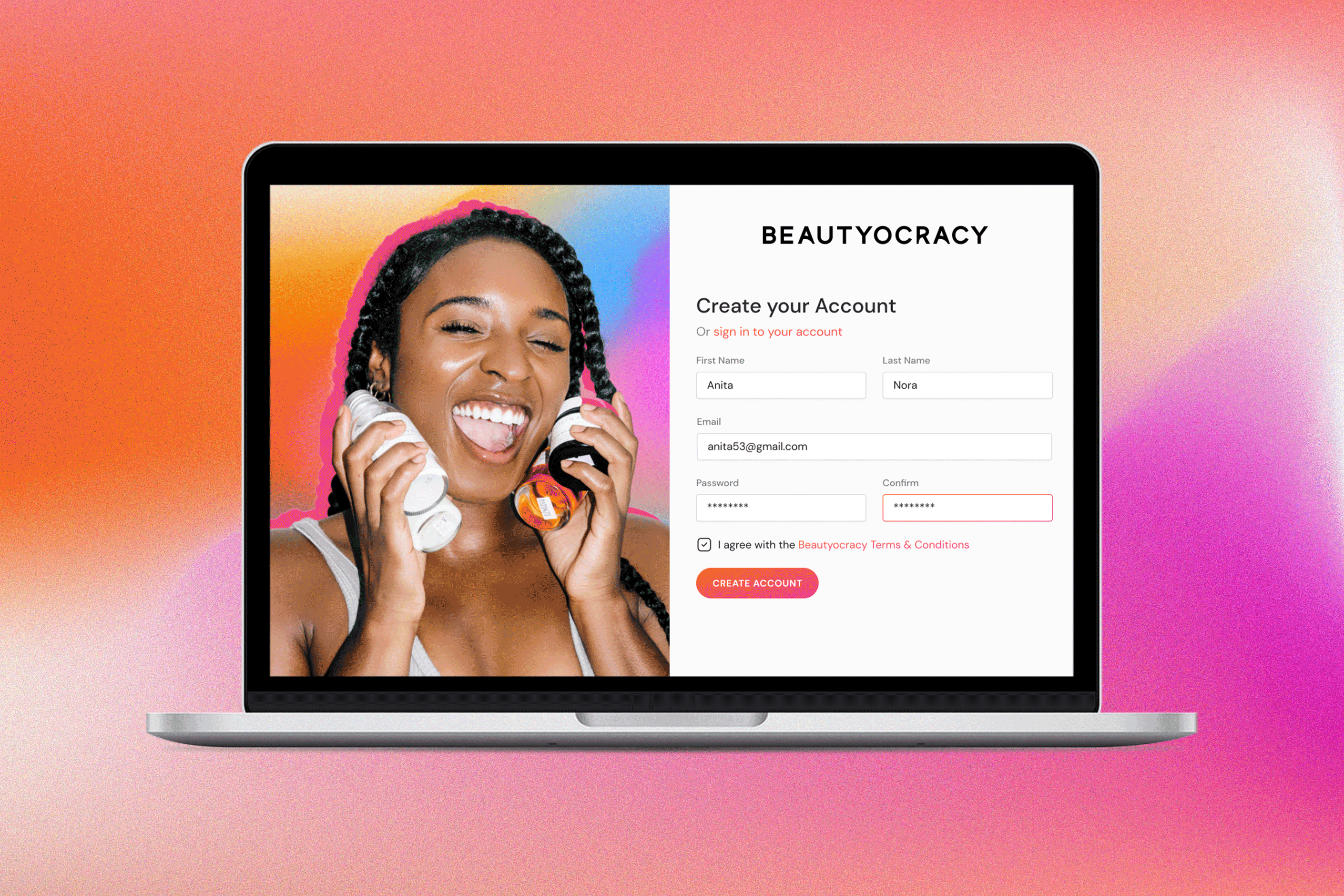
Edit profile was hidden. Users expected it under the profile tab in the top navigation, not where we'd placed it. A classic discoverability issue.

No notification system. Users wanted alerts when people they follow add products, post reviews, or create content. The social layer needed real-time feedback loops.

Search was too limited. Users wanted to search for specific people, products, and content. The browse-only model wasn't enough.


Post Launch Research

After beta testing, we conducted additional interviews with 8 users to dig deeper into unmet needs. Three insights shaped the product roadmap:

Exclusion runs deep. Women of color feel the beauty industry actively excludes them. The pipeline of brands that scale isn't diverse enough. This validated Beautyocracy's entire reason for existing.

Community interaction is the killer feature. Users wanted discussion boards, comment threads, and the ability to start conversations. The platform needed to be social, not just informational.

Video content wins. Short video clips, video reviews, skincare advice in video format. Users found this more engaging and trustworthy than text reviews alone.

Wearing Multiple Hats

This was my first real product role, and the scope of what I touched was broad:

Research synthesis. Distilled 100+ interviews into actionable patterns that directly informed feature decisions.

Brand identity. Built a comprehensive style guide during the company rebrand, defining colors, typography, and logo elements that represented Beautyocracy's mission of authentic, diverse, inclusive beauty.

Wireframing and prototyping. Developed user flows and iterated on wireframes based on ongoing team feedback, translating research insights into interaction designs.

Usability testing. Led 5 usability tests and conducted 3 additional user interviews post-beta. Went from research plan to moderation to synthesis.

Reflections

Social proof is a design system, not a feature. It's not enough to add a reviews section. The entire information architecture needs to be organized around trust signals. Match percentages, shared attributes, community endorsements: these have to be woven through every screen, not bolted on.

Identity-first design changes everything. When your users' core need is "find people like me," every default, filter, and recommendation algorithm has to center identity. Generic personalization doesn't cut it.

Launching is learning. The beta usability findings were more valuable than any pre-launch research because users were interacting with a real product with real stakes. The gap between "what users say they'll do" and "what users actually do" showed up in every session.

Let's connect :)

Always happy to chat about design, research, or potential opportunities.

Let's connect :)

Always happy to chat about design, research, or potential opportunities.

Let's connect :)

Always happy to chat about design, research, or potential opportunities.

©

2026